This is a level 3 statistics activity from the Figure It Out theme series.
A PDF of the student activity is included.
Click on the image to enlarge it. Click again to close. Download PDF (571 KB)
interpret data shown on a pie graph
show fractions on a pie graph
find all possible outcomes
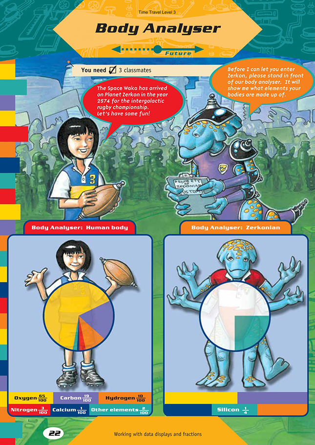
FIO, Level 3, Theme: Time Travel, Body Analyser, pages 22-23
3 classmates
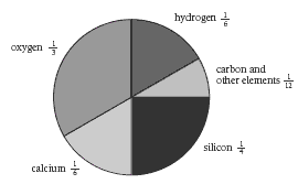
Activity One
You may need to start this activity by discussing with the students the information they are able to obtain from the pie graph and how they can interpret it to make up statements. Afterwards, the students might like to discuss their three statements with a classmate.
For question 2, encourage the students to consider the strategies they could use to complete the pie graph for the Zerkonian. They may convert all of the fractions to twelfths, divide the pie graph into twelfths (like a clock face), and then complete the pie graph. Number lines may help with this task:

For your information, the exact make-up of elements in the human body is as follows: oxygen 65%, carbon 18.5%, hydrogen 9.5%, nitrogen 3.2%, calcium 1.5%, other elements 2.3%.
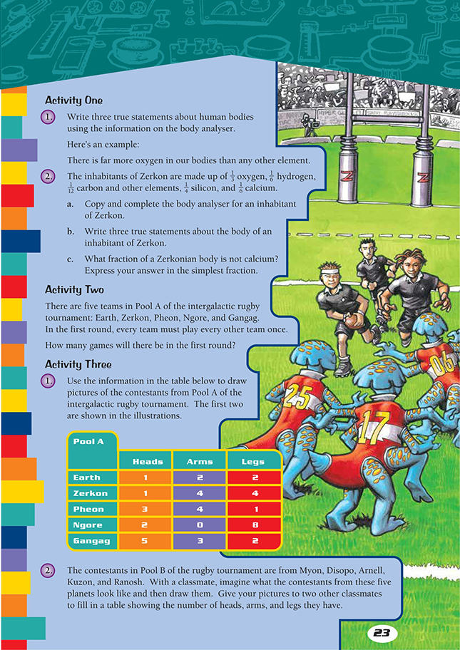
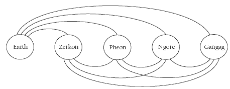
Activity Two
To help the students calculate the number of games in the first round of the rugby competition, draw a diagram like the one sketched below. Each line is a game. Count the number of lines to work out the number of games in each round.
Activity Three
The students’ drawings here will need to be fairly simple and clear to allow their classmates to count the heads and limbs easily. Note that they don’t need to draw the contestants from Earth and Zerkon because these are already shown in the illustrations.
In question 1, the students interpret the data displays in order to draw the contestants. In question 2, they swap pictures with classmates and record details about the contestants in data displays.
Answers to Activities
Activity One
1. Teacher to check
2. a.
b. Teacher to check
c.
Activity Two
10 games
Activity Three
Practical activity