This is a level 4 statistics activity from the Figure It Out series.
Click on the image to enlarge it. Click again to close. Download PDF (265 KB)
construct a line graph
answer questions from a graph
describe the data
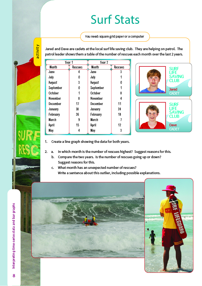
FIO, Level 4, Statistics, Book One, Surf Stats, pages 8- 9
Square grid paper or a computer
If possible, the students should create the line graph asked for in question 1 using a computer spreadsheet and graphing program. They could enter the data in a single column and produce a single line graph for the 2 years, but if they enter the data in 2 columns (as below), they can create a graph that shows the 2 years as separate lines. This will make their comparisons easier.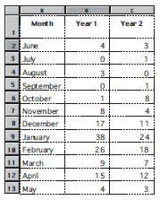
Highlight (select) the cells that contain the data and choose the scatter graph option. This will give you a double line graph with the data points between the tick marks on the horizontal axis. You can correct this by following these steps:
- Right-click on any of the labels on the horizontal axis (on a Macintosh, hold down the control key and click).
- Choose the Format option.
- Click on the Scale tab.
- Remove the tick next to “Value (Y) axis crosses between categories”.
If you want help with computer spreadsheets and graphs, see the introduction to the teachers’ notes for Statistics: Book Two, Figure It Out, Years 7–8.
When they have completed questions 1 and 2, it may be appropriate to get the students to design their own investigation involving the collection of time-series data. This could mean recording the temperature at every hour throughout the day, taking the evening NZSX 50 index, or recording the number of cars travelling past a particular point during every tenth minute. Some data collected over a short period of time (for example, the temperature) will show a trend. Other data (for example, the NZSX 50 index) will show a trend only if studied over a long period of time.
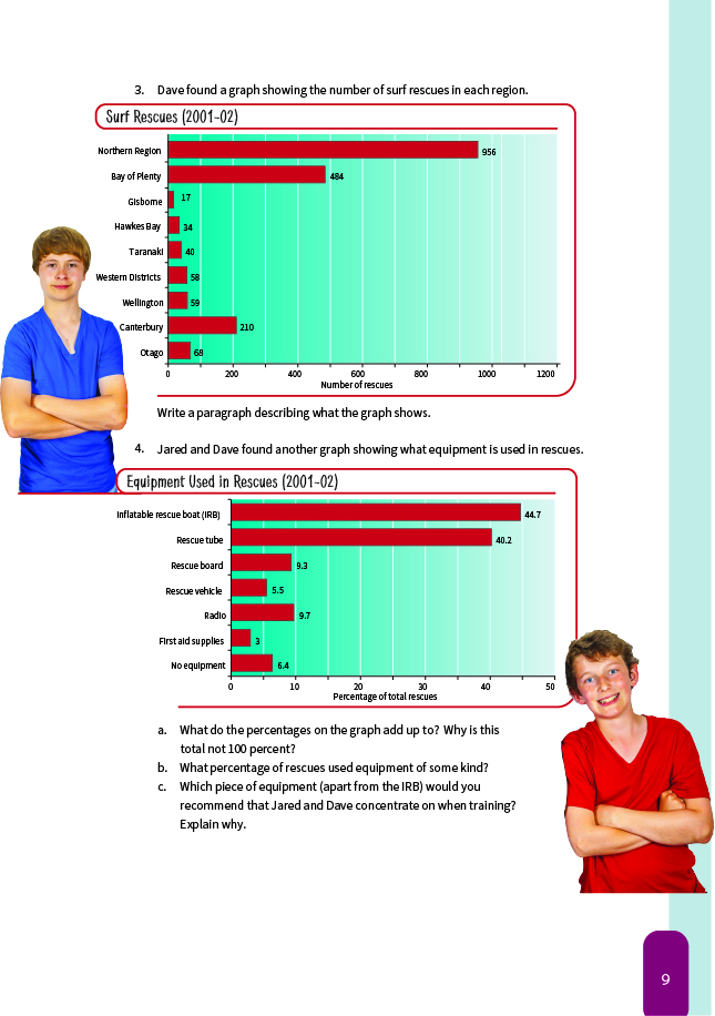
The graphs given in questions 3 and 4 are useful ones for the students to read and comment on. You could increase the difficulty of the maths by asking your students to calculate fractions and/or percentages and to make comments based on these. You could also ask more demanding questions, such as “How many of the rescues in the Northern Region are likely to have used an inflatable rescue boat?”
Question 3 asks the students to describe what the graph shows. It is important that they do not make unsubstantiated guesses about causes and treat them as facts. When they describe what the graph shows, encourage them to restrict their comments to statements of fact that can be read or calculated from the graph.
Answers to Activity
1. Your graph could be similar to this one or could show the 2 years as a single line: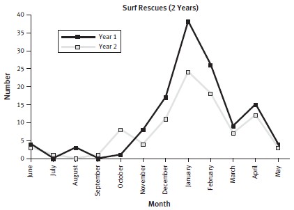
2. a. January is the month with the most rescues in both years. January is the main summer holiday month, so more people are at the beach.
b. There is a downward trend. If you compare the same months in the different years, the second year generally has a lower number of rescues. This could be the result of an effective water safety campaign or of poor weather meaning
that fewer people were at the beach.
c. October in the second year has an unexpectedly high number of rescues. Explanations will vary. The reason could be a one-off rescue involving a lot of people or a hot Labour Day meaning more people swam and were involved in waterbased activities.
3. Paragraphs will vary but should include at least three points similar to the following:
- The graph gives the number of rescues by geographical area.
- It covers the period 2001–2002.
- By far the most rescues (50%) were in the Northern Region.
- 85% of rescues were in the North Island; 15% were in the South Island.
- Most of the rescues were in areas with warmer water.
- The Northern Region includes Auckland. It contains far more people than any other region, so it has more swimmers.
- The order of the bars runs from north to south.
- Canterbury had about 11% of the rescues.
4. a. 118.8%. Rescues sometimes use more than one piece of equipment.
b. 93.6%. (100 – 6.4)
c. The tube is the most obvious answer, but you could argue that the boys should concentrate on the lesser-used equipment because they will be least familiar with it.