This is a level 4 statistics activity from the Figure It Out series.
A PDF of the student activity is included.
Click on the image to enlarge it. Click again to close. Download PDF (776 KB)
decide which graph most clearly shows the data
answer questions from the graph
make predictions based on the data
conduct a survey
use a spreadsheet to create a bar graph
A computer
Classmates
This activity appears straightforward but may cause difficulties. In particular, the students need to understand fractions and be able to convert them to decimals and percentages if they are to mathematically predict option choices for the additional 50 students. They also need to know how to calculate what fraction of a number a quantity represents. This suggests that they should be at stage 7 (advanced multiplicative part–whole) of the Number Framework.
It is important to discuss with the students the characteristics of a quality data display. Essentially, it means that the key ideas can be seen at a glance, there is no undue loss of data, and the information is presented honestly (without distortion). A graph with axes must have:
• an explanatory title
• axes ruled at right angles
• suitable, honest scales, marked off in equal intervals
• labelled axes that identify the units used.
For other kinds of graph, the sectors must be labelled or a key provided.
Students using a computer graphing program should be strongly discouraged from choosing one of the numerous 3-D graph options. These look sophisticated, but they are hard to read, and they distort areas visually. A 2-D graph will almost always be a better choice.
Another useful concept that could be discussed with an able group is “data richness”. A data-rich graph is one that retains as much of the original information as possible (instead of merging or eliminating it) while displaying it with a minimum of ink (for printed graphs) or pixels (for on-screen graphs). A data-rich graph can be explored in detail from different angles and is able to tell a number of stories.
Your students could examine the types of graphs that are able to be drawn using a spreadsheet program or that are published in newspapers and magazines. Many will not meet the above criteria. They could make a wall display of such graphs, criticising their shortcomings.
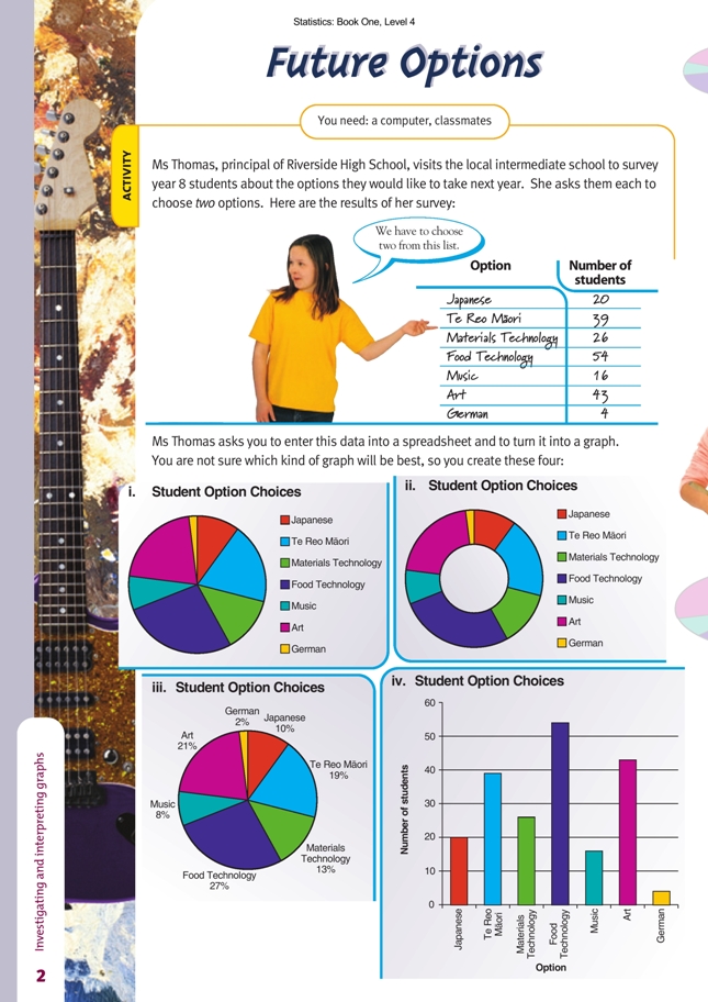
Answers to Activity
1. The bar graph is best. It shows how popular each subject is and the number of students taking it. The doughnut graph and the pie graphs do not give numbers. The two with the separate legends (keys) are hardest to understand. Even in the best pie
graph (iii), it is hard to compare the size of the sectors without measuring them.
2. 101. (There are 202 option choices, and each student chose two options.)
3. a. Practical activity. One way to make a prediction is to look at what the other students have chosen and assume that those who were away on the day would make similar choices. (If 1/10 of the students surveyed chose Japanese, it is reasonable to guess that 1/10 of those absent would also choose Japanese.)
b. Answers may vary. Using the method described in a, the projected numbers would be 30, 58, 39, 81, 24, 64, and 6, as in this table:
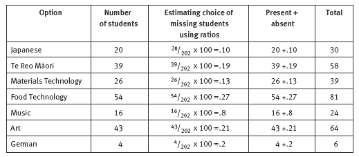
c. Practical activity. The above table shows how the numbers have been combined.
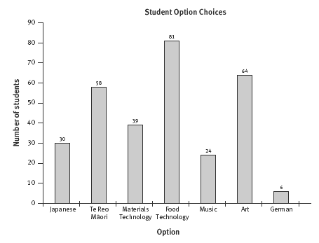
d. Here is one example of a suitable graph:
4. a. Probably not. 6 students is unlikely to be enough for a year 9 class.
b. 3. This would give 3 classes of 27, which is a reasonable size for a class.
5. a.–c. Practical activity. Results will vary.