Sports
In this unit data about sporting activities is collected and presented using dot plots and bar graphs.
- Display numerical data using dot plots.
- Display categorical data using bar graphs.
- Discuss features of data display.
The key idea of statistical investigations at level 3 is telling the class story with supporting evidence. Students build on the ideas from level two and their understanding of the PPDAC (Problem, Plan, Data, Analysis, Conclusion) cycle – see Planning a statistical investigation – level 3 for a full description of all the phases of the PPDAC cycle. Key transitions at this level include posing summary investigative questions and collecting and displaying multivariate and time series data.
Summary or time series investigative questions will be posed and explored. Summary investigative questions need to be about the group of interest and have an aggregate focus. For example, What types of lunch-time activities do the students in year 5 like doing? What are the heart rates of students in our class?
Data displays build on the use of frequency plots from level two and can be formalised into dot plots and bar graphs. Students should be encouraged to show a second variable, for example, by using colour. They may like to look at boys’ and girls’ lunch-time activity preferences.
Students will be making summary statements. For example, the most common resting heart rate for our class is 70 beats per minute, four people have a resting heart rate of 66 beats per minute (read the data), or most students (16 students out of the 27 in our class) have a resting heart rate between 65 and 75 beats per minute (read between the data). Teachers should be encouraging students to read beyond the data by asking questions such as: “If a new student joined our class, what resting heart rate do you think they would have?”
Dot plots
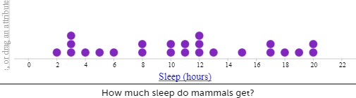
Dot plots are used to display the distribution of a numerical variable (for example, hours of sleep) in which each dot represents a value of the variable (for example, 8 hours). If a value occurs more than once, the dots are placed one above the other so that the height of the column of dots represents the frequency for that value. Sometimes the dot plot is drawn using crosses instead of dots. Dot plots also be used for categorical data (i.e. data that can be organised into distinct categories, such as types of preferred lunchtime activities).
Bar graphs
In a bar graph equal-width rectangles (bars) represent each category or value for the variable. The height of these bars tells how many of that object there are. The bars can be vertical, as shown in the example below, or horizontal.
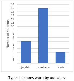
The bar graphabove shows the types of shoes worn in the class on a particular day. There are three types of shoes: jandals, sneakers, and boots. The height of the corresponding bars shows that there are six lots of jandals, 15 lots of sneakers and three lots of boots. It should be noted that the numbers label the points on the vertical axis, not the spaces between them. Notice too, in a convention used for discrete data (category and whole number data), there are gaps between the bars. A histogram, which features bars without gaps, is used to present continuous, numerical data that has been organised into continuous intervals (e.g. average temperature inside the classroom over the course of a day). Histograms are covered further at late Level 3 and at Level 4.
The learning opportunities in this unit can be differentiated by providing or removing support to students and by varying the task requirements. Ways to support students include:
- setting up a plan for data collection for students to follow
- altering the type of data collected; categorical data can be easier to manage than numerical data
- adjusting the type of analysis – and the support given to do the analysis
- providing pre-prepared graph templates to support students developing accurate scales for axes
- providing prompts for writing descriptive statements
- using digital tools to record data, create graphs, write summary statements, and present data displays
- grouping students so they can support each other (tuakana teina) and justify their reasoning.
The context for this unit can be adapted to suit the interests and experiences of your students. The statistical enquiry process can be applied to many topics and selecting ones that are of interest to your students should always be a priority. Consider how you could make links between this unit and learning from another curriculum area. For example, to complement learning about conservation and the life cycle of plants, you could frame the unit around creating a graph showing native plants found in the bush, or birds observed in the local environment. Comparisons to the amount of birds could be made from one day to the next, or at two different times of the day.
Te reo Māori vocabulary terms such as kauwhata ira (dot plot, dot graph), kauwhata pou (bar graph), tauanga (statistics), kohikohi raraunga (data collection), raraunga whakarōpū (category data), and raraunga (data) could be introduced in this unit and used throughout other mathematical learning. Numbers in te reo Māori can be used alongside numbers in English.
- Stop watch
- Prepared dot plots
- Coloured squares or sticky notes
- Calculators
Session 1
We begin the session by looking at our resting heart rate and our heart rate after we’ve done some exercise. We display this data using dot plots. Discuss with the students what they already know about dot plots graphs. Show and discuss some examples. These could be found in media (e.g. newspapers, CensusAtSchools data) or in texts. Briefly refer to the important features (e.g. title, y and x-axis, scale, regular intervals, type of data displayed - number or category). Explain that you are going to collaborate (mahi tahi) and create a dot plot. You have chosen a dot plot because you want to display number/numerical data.
- Pose the problem: About how many times will your heart beat today?
- Ask the students to indicate whether they think it will beat more than thousand/ more than ten thousand/ more than a million.
- Discuss ideas that the students have for working out the answer. List these ideas on the board, for example:
- Need to know the number of beats per minute and then the number of minutes in a day.
- Need to consider that our heartbeat changes.
- We want to explore heart rate, what does heart rate mean? [heart rate is measured by the number of beats of the heart per minute (bpm), another term is pulse rate].
- Ask the students to plan a way of finding how many times their heart beats in a minute. Can they find their pulse? Possible places include the neck (carotid artery) and wrist (radial artery).
- Share plans, for example:
- Work with a partner who tells you when a minute has passed (using the second hand on the class clock).
- Work with a partner. Count the beats for 15 seconds and then multiply by 4.
- We are first going to find our resting heart rate, exploring the investigative question (Problem): What are the resting heart rates of our class? What might we need to do before we find this? (more planning). We need to make sure we have rested e.g. sit still for some time e.g. 5 mins or be mindful for 5 mins. Once we have “rested” everyone can find their resting heart rate using the method decided on. You could explore the patterns of numbers if the method to get the heart rate is to time for 15 seconds and then multiply by 4, or to time for 10 seconds and multiply by 6, or to time for 30 seconds and double.
- Draw a dot plot scale on a chart, digital display, or on the board. Note normal pulse rates at rest for children over 10 years and adults is 59-99. As we want to include the heart rate after exercise on the same dot plot suggest the plot is from 50-170 using 10s only. In the picture below you can see a faint dotted line, we will put the after-exercise heart rates above this line.
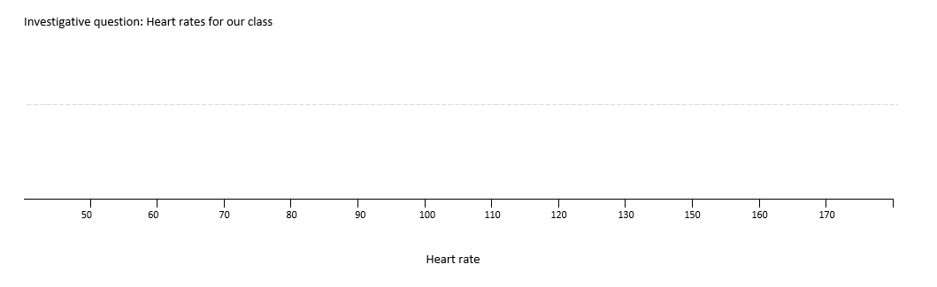
- Have a student tell you their resting heart rate (76). Plot it on the graph without explaining how you positioned it. Ask another student to tell you the resting heart rate and put it on the graph. Again, do not give an explanation. (Data and analysis)
- Then ask the students:
Can anyone explain why I have put those numbers at that place on the graph? [Think about scale. For example, 76 is just over halfway between 70 and 80]. - Now get the students to add their heart rates on the graph.
- Look at the dot plot and discuss. Ask the students “What do you notice?” (Analysis)
Where are most of the heart rates?
Which heart rate is near the middle? (Dot plots are great for answering this question as you can mark where you think the middle is and check that half the data is to the left and half the data is to the right)
Which heart rates are grouped together in clusters?
Which heart rates are lying outside the cluster? - Hand out the heart rate dot plot template (Copymaster 1). Get the students to make a copy of the data collected for the class on their own dot plot. Point out that they want to try to keep the data for resting heart rate in the bottom half of the display.
- Discuss the factors which cause heart rates (heart beats) to vary.
- Now send the students out for a two minute fitness run. Get them to take their pulse again and put the figures above the resting heart rate figures on the dot plot. Students can add to their graphs at the same time as you are collecting the data from the class. They should label the two groups on their dot plot: bottom group is the resting heart rate; the upper group is the heart rate after exercise. Get the students to make statements about the data they collected, what do they notice.
Are there any surprises?
What are the differences between the two sets of data?
Ensure the statements include the variables (resting heart rate and heart rate after exercise) and the group (our class). As this is numerical data the statements should also include values and units (beats per minute). Use this information to answer the investigative question using evidence from our statements (conclusion). Students can share their statements with each other and provide feedback to each other. - At the end of the session reflect on the initial problem about heartbeats in a day. Leave this as a problem for the students to work on during the week.
Session 2-3
In these two sessions we focus on the use of bar graphs to display results of categorical data.
Discuss with the students what they already know about bar graphs. Show and discuss some examples. These could be found in media (e.g. newspapers, CensusAtSchools data) or in texts. Briefly refer to the important features (e.g. title, y and x-axis, scale, regular intervals, type of data displayed - number or category). Explain that you are going to collaborate (mahi tahi) and create a bar graph. You have chosen a bar graph because you want to display category/categorical data
- State the investigative question (problem): What lunchtime activities do the students in our class like? Adapt this question, if necessary, to better engage your students.
- To answer the investigative question, we will ask the students the following survey question: Which activity do you like doing at lunchtimes? We list the possibilities on the board (plan). E.g. sport, music, coding/robotics, garden club, reading café, art
- Discuss ideas for quickly deciding which is the favoured activity (plan and data). We might also need to discuss if the survey question needs to change – students might like all of the activities, so we could change to What activity do you like doing the most at lunchtimes. Discuss how to collect the data from the class. This could include:
- standing in lines according to the activity you most like doing
- putting a tally mark under the activity you most like doing
- putting a post-it under the activity you most like doing.
- Discuss ideas for making a permanent display of the data. As a class, make a bar graph with each student placing a coloured square or post-it above their preferred activity. Discuss the need for the pieces of paper to be the same size and pasted on the paper as evenly as possible. This graph could also be created digitally and displayed on a class screen.
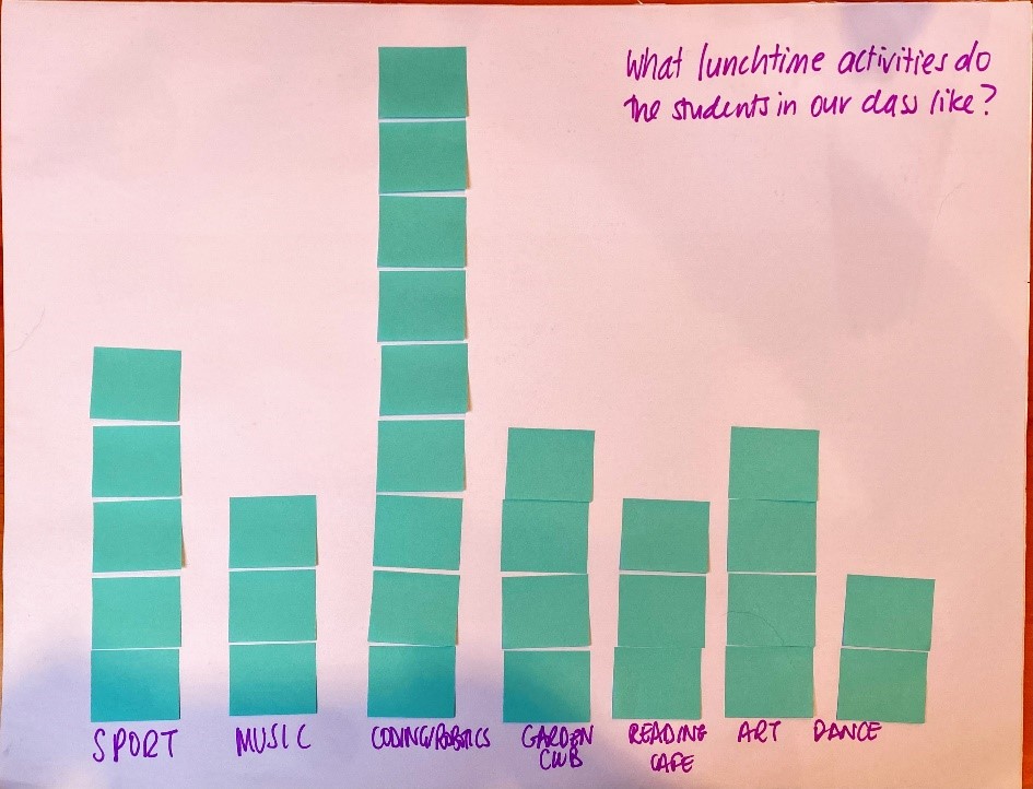
- Look at the bar graph.
Are there any surprises in the data we’ve collected?
What can you say about the information in this graph? - Tell the students that the principal has asked the class to find out which equipment the school should buy for lunchtime activity. (A letter from the principal or a request in person would be useful here.)
- Get small groups of students to investigate, using the PPDAC cycle, the equipment the school has for a particular activity (cricket gear, rugby balls, board games, library books, robots, dance equipment etc) and put the information on a bar graph. The equipment can then be "matched" with the bar chart about the students’ preferred activities. Students could create graphs digitally (e.g. with Google Sheets, CODAP, or Microsoft Excel), on graphing paper, or with the use of post-it notes. Consider what will be most beneficial and engaging for your students.
- They will then give recommendations to the school principal (write letter, give presentation, e-mail) for increasing or decreasing the equipment available to the students at lunch time (conclusion – communicating findings).
Session 4-5
Over the next two days the students gather information around the theme of sports. They use the PPDAC cycle to collect, display and share the information with others.
- Brainstorm ideas for sports investigations. List these on the board. Some ideas could include:
How many crunches (sit ups) can they do in a minute?
How many breaths do they take in a minute before exercise, after exercise?
How long does it take to run a certain distance (time in seconds)?
How many skips can they do in a minute? - Look at the list of ideas and discuss the ones that would be suitable for display as a dot plot (numerical data) or a bar graph (categorical data).
- Let the students work in pairs or small groups to identify their investigative question and plan to collect the data to answer their investigative question. Have them consider the practicalities of data collection. Once this has been checked with the teacher the students can collect their data according to their plan, make data display(s), write statements about their displays and answer the investigative question using evidence from their displays. Consider their method for creating data displays - they could use a different method from the last session, or could develop their skills with the same method.
- Students should present their findings as a report or presentation. Discuss with students the features that you want them to include in their report of the investigation. The reports could include:
- The investigative question.
- A description of how the data was collected.
- A data display
- A written summary about the data, including an answer to their investigative question.
Remind them to include the variable and the group in any statements they make about the data, and if the data is numerical to also include values and units. Give students the opportunity to share their learning with others within the class or as a whole class group.
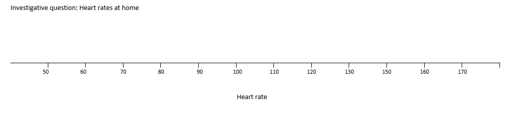
Dear family and whānau,
At school this week we have been gathering information about our heart rates. We have displayed the data using a dot plot. A dot plot is useful for arranging numerical data in a display. Ask your child to share with you how we found our heart rates and then can you place the heart rates of your family on the chart below.
We have been solving heart-beat problems with the help of calculators. Here’s one for you to work on with your child:
How many times does your child’s heart beat in a week?